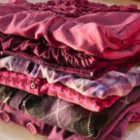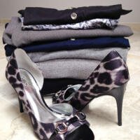
With a little break in the snowing action, I took the opportunity for a bit of thrifting. Unlike my last Radiant Orchid haul, this interlude was all about the greys. Look at the pieces de resistance – the Carlos Santana heels! I’m putting them on as soon as I dont need snow boots anymore. Some nice knits, too; a curvy black sweaterdress with huge ribbed portrait cowl, an open-front long cardi from Old Navy with silver metallic bling, and a cashmere crew with black contrast sleeves. Add a couple tops and some really nice White House/Black Market black and white tiny check pants, and it’s a wardrobe. With snow leopard!
Gathering Orchids
I mentioned how pleased I was with the color of the year, Radiant Orchid. The thought of plummy pinks and purples being all over the stores just fills me up with excitement and anticipation; I love purple – wearing it, being around it, soaking up the purpley vibe. This week has been busy with working on some new upcoming patterns, and I needed a morning off – so, why wait to seek out some purple inspiration? I do consider shopping to be recreational, and by “shopping,” I certainly do not necessarily mean “buying.” For me, it’s all about going to look around, touch things, and find a little eye candy. If I actually need something specific, I’m more than likely to buy online – and that’s not quite “shopping” but more like “acquiring things I need.” The really real shopping is all about going out of my everyday environment and seeing what sort of fabulous thing I might discover. One of my favorite subsets of shopping is thrifting, because there’s no better way to find . . .
Radiant Orchid
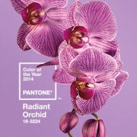
With the Spring 2014 palette forecast by Pantone comes the new reigning color: Radiant Orchid is the Color of the Year for 2014. Out with the regeneration and healing of Emerald, and onward with the innovation and creativity of Orchid. Pantone opines “an enchanting harmony of fuchsia, purple and pink undertones, Radiant Orchid inspires confidence and emanates great joy, love and health. It is a captivating purple, one that draws you in with its beguiling charm.” I’m certainly beguiled by purples, which are more daring and unexpected than the red, green and blues. This one in particular is a bit off-beat, with the very pink undertones, and the creamy, strong white value. It’s a color that makes you think, hey, that would go with my favorite black outfit . . . and in my living room . . . and I need new nail polish. Somehow it goes with everything in the rest of the Spring palette, and it’s strong enough to stand up to what are sure to be the deeper, richer fall colors. . . .
Fall 2012 Pantone Fashion Color Report
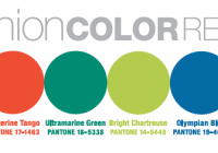
Now that back-to-school is a reality, in my mind fall has officially arrived. And fall of course means a mental adjustment, back to serious work and a more pulled together look – I’m eagerly anticipating the ability to wear more sweaters and accessories. The forecasters released their visions for Fall 2012 two seasons ago, but now we’re finally in the moment. As is typical with me, I personally prefer the subdued edges of the color line above, but can see Pink! Tangerine! even Chartreuse! as an accent. That Ultramarine Green is the only one I cant imagine myself doing anything with – it looks like Forest to me, but as that’s my son’s favorite, I’m sure I’ll be seeing some of it. Here’s what Pantone has to say: As the season transitions from the heat of summer, Bright Chartreuse, a vital yellow-green, pays homage to a typical spring shade and creates a bridge into the cooling days of fall. Reminiscent of bright green foliage, it provides a perfect accent to every color in the palette. . . .
Tuesday Shoes Day – Zodiac
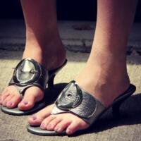
There’s nothing like a big buckle shoe for instant impact. These are my daughter’s favorites, although it looks like perhaps they aren’t fitting her quite as well as one would hope. No matter, a toe thong isn’t my first choice so I haven’t worn them much myself. Despite the thong issue, they’re very comfortable – as one might expect from Dr. Scholl’s – “feel crazy good” it says. One might NOT expect a cute little 2″ stacked heel and that nice metallic pebbled leather, but there it is! I do love silver metallic leather, which was probably my whole reason for buying these in the first place. Look – they go with my purse. Not that I’m all about matchy-matchy, but still . . . more like a snapshot of the kind of accessories I like best. I could see these for a casual summer patio meal, as long as the wearer isn’t the one running around serving.
Tuesday Shoes Day – Talk
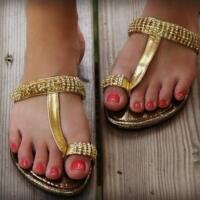
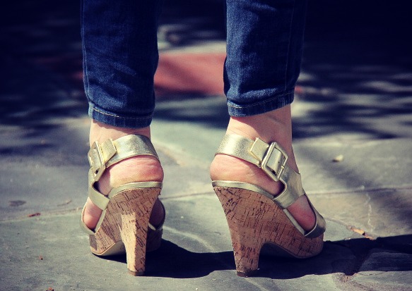
I’m liking the concept so much that I think Tuesday Shoes Day may become a recurring feature. I certainly have enough shoes to keep it going for a while. These are cruelty-free gold pleather sandals with cork wedge heels; I especially like the way the wedge is shaped so it’s not super clunky. Franco Sarto is one of my favorites, and I always keep an eye out for them; these came from – of all places – the (mostly) kids’ consignment shop. Although they do have teen/some adult stuff, I certainly wasn’t expecting to find mint condition cool shoes there. It just reinforces the vintage-shopping mantra – You Never Know. Cute, right?
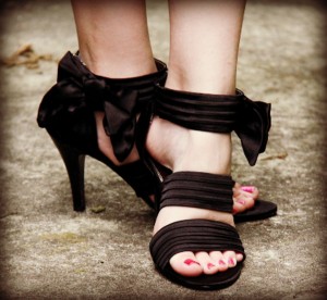
Lots of secret knitting going on, so not much posting – due to both all the knitting and the need to be covert. So what better alternate topic to explore than fabulous shoes? For a bit of mother-daughter lunch and shopping, we went to PF Chang’s and then stopped by the DSW. Shopping the sale rack far surpassed the steamed pork dumplings; for less than half the cost of lunch, we are now the proud owners of this lovely pair of Bandolino Barika party stilettos. And I say “we” with the bittersweet realization that girlfriend and I are now the same shoe size. In fact, she might be one half size larger, depending. I’m determined to be the first one to have an appropriate place to which I might wear them. I’m thinking the fancy dinner that she and her friends are preparing for the parents in a few days; she’ll need flats because she’ll be cooking and serving. I’ll be sitting and possibly gliding to the bar area. Anyway, the shoes are . . .
Fall 2011 Pantone Color Forecast
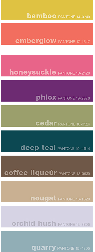
Autumn is here, whether you live in a 4-season climate, or a place that’s less changeable. Here’s what you can expect to see in store, right now. Pantone’s Fall 2011 Fashion color palette, presented back in spring when New York’s Fall Fashion Week unveiled designers’ vision for autumn, shows a painterly approach to fashion. I personally am drawn to the lower half of the palette, which is no surprise to my friends who describe me as liking “no-colors.” However, even I can see the beauty of the pop of a honeysuckle scarf in a deep teal and coffee outfit. And certainly for the circus ponies among you, there is no shortage of saturated fall tones, and no reason you cant mix them together. A more detailed description, from Pantone: Bamboo a surprising fall hue, brings a warm, exotic flavor to the season. Like a filtered sunset on the waning days of fall, Bamboo is a standout yellow with a subtle green undertone. This dappled shade pairs dramatically with several of the top 10, including . . .