
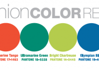
Now that back-to-school is a reality, in my mind fall has officially arrived. And fall of course means a mental adjustment, back to serious work and a more pulled together look – I’m eagerly anticipating the ability to wear more sweaters and accessories. The forecasters released their visions for Fall 2012 two seasons ago, but now we’re finally in the moment. As is typical with me, I personally prefer the subdued edges of the color line above, but can see Pink! Tangerine! even Chartreuse! as an accent. That Ultramarine Green is the only one I cant imagine myself doing anything with – it looks like Forest to me, but as that’s my son’s favorite, I’m sure I’ll be seeing some of it. Here’s what Pantone has to say: As the season transitions from the heat of summer, Bright Chartreuse, a vital yellow-green, pays homage to a typical spring shade and creates a bridge into the cooling days of fall. Reminiscent of bright green foliage, it provides a perfect accent to every color in the palette. . . .